Sunday, October 23, 2011
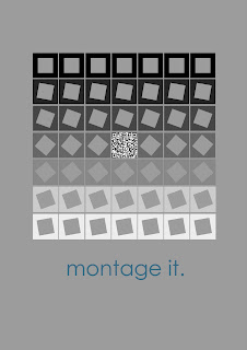
Montage It. Final Poster

Saturday, October 22, 2011
Montage It. Final Presentation:
Project Explanation
The intent of this project was to present an interconnected analysis of Renoirs ‘Bal du Moulin de la Galette’ and the sculptural work of Eduardo Chilida titled ‘Mount Tindaya’. Considering notions including the interplay of light and shadow, the distortion of a responder’s perception and carved or negative space.
The balsa model form I created is a series of thin squares, which each are spaced with a smaller square cut from within at a different angle to the edge. This creates a form, which from the exterior appears to be a rather simplistic and linear rectangular prism. However when we begin to consider the interior space, we realise that it is actually rather complex. This presents the notion, as expressed by both Renoir and Chilida, that what you perceive on the surface of a form may actually be completely different to that of the interior. Whether in a physical state, as of Chilida, negative space carved from within a mountain defined by the interplay of incoming light, or a conceptual state, as within Renoirs painting. The model enhances this notion, as the shift between a simplistic and complex form occurs entirely through vertical planes, allowing the responder to look right through the side of the form. The removal of horizontal elements or planes, allows light to enter between each of the vertical planes, at an intensity defined by the depth between the exterior and interior space. Therefore casting a proportionate shadow.
The main flip book I have presented is a series of individual slides, which starting from the back of the model (the face with a rotated square cut out) are inserted starting with slide 1, moving forward up to slide 14. Each slide presents a section of this analysis based upon Renoirs painting, while further considering the notions portrayed by Chilida. Therefore the flip book provides a manual journey, of both the overall analysis and the space within and surrounding the model. As each slide is inserted, the space decreases, hence providing a gradual journey. Note it is recommended that before each slide is inserted, it is held up to the light.
The montages presented work seamlessly together to enhance this notion of light and shadows interplay upon form. Fading from dark to light, thus left to right we identify a transition between night and day, which in black and white allows the definition of forms as a result of light and shadows interplay to be enhanced in the background. While each slide from the analysis hangs in the foreground on wire, providing a reference point to the overall concept being presented.

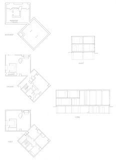
Draw It. Poster

The style of poster I decided to use was one which not only portrayed the drawings I completed but further the nature of the task. Therefore I portrayed the drawings as if placed on a table with pencils and such surrounding. This implies not only the idea of the Fisher House itself but further the notion that this poster is about hand drafting.
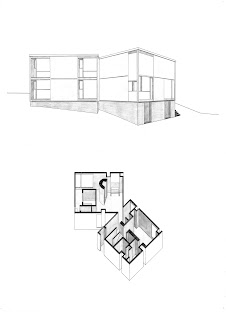
Draw It. Final Presentation Renderings
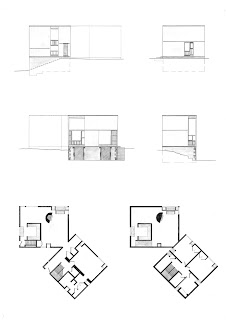
Draw It: Final Presentation Drafting

